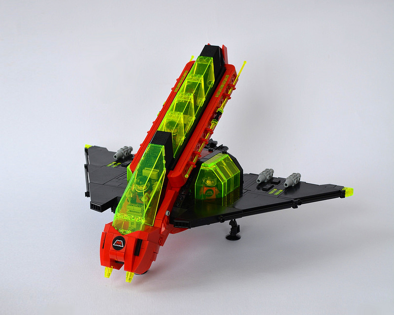
Spaceships like this build by Guido Martin-Brandis make me want to build some MOCs from Classic Space themes myself. Great color use, fun details, and most of all: a vehicle that just screams to be swooshed! The aggressive angling of the main body of the starfighter looks great, as do the stacked windshields. And despite the complex shape, each section meets the others smoothly and cleanly.
Admire all the angles over on flickr.


Thanks for the feature – so glad you enjoyed it. Was a tricky build to work it out (I never seem to be able to build simple), but satisfying once it came together! Hope it inspires you to try a retro theme!